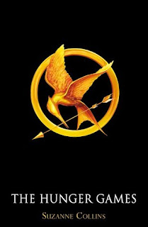
This month I'm looking the covers of a very popular book - The Hunger Games by Suzanne Collins. I have to confess I haven't read it as yet but I do plan to pick it up before the film comes out and find out all about this Katniss I've been hearing about! In the meantime, lets have a look at those covers!
 |
| US Paperback |
 |
| US Hardcover |
 |
| UK Paperback |
 |
| Italian Paperback |
 |
| Chinese Cover |
 |
| German Paperback |
 |
| Film Tie In Cover |
US Hardcover - The bird-arrow symbol is interesting but I don't like the font very much. It's very blocky.
US Paperback - the girl is just glimpsed almost through the cover and there are blood splatters over the cover. I like the target but overall, this isn't a very interesting cover to me
UK Paperback - I don't really like the big picture of the girl through the HG letters - it seems cartoon-y and I don't connect to her at all. I think this is my least my favourite cover, which is a shame as it's also the one I actually own.
German Cover - A closeup of a girl hiding behind a tree with some blood on the leaves...it's nice to see some colour in some of these covers.
Italian Cover - the girl on the font of this looks like a zombie to me! A very scary cover that makes The Hunger Games look like a horror story...
Chinese Cover - Again I like the bird-arrow motif which takes centre stage. The background is light and misty with two indistinct figures running through the woods. Very visual and different from anything I've seen for a while.
Film Tie In - I don't normally like film tie-in covers but this is actually really striking. The black background with the close up bird-arrow motif in gold is clear, beautiful and intriguing. It makes me want to know more about the book!
My Verdict - I like the Chinese and Film Tie in ones best. I think the simpleness of the Film Tie just beats out over the woods - it elegant and one I would love to have on my bookcase!
Which cover do you prefer? :)
I still prefer US hardcover but I admit the Film Tie-In is nice as well. Elegant and simple.
ReplyDeleteHonestly they all suck, they are all boring
ReplyDeletePsst look how boring the Swedes are,
http://nellasbocker.blogspot.com/2011/08/grand-opening-och-hungerspelen.html
http://ciliaskultur.blogspot.com/2011/07/hungerspelen-trilogin.html
The above one is better, but then they use the same cover, sighs
I like the US hardcover one far more than the movie tie-in. Though the two are definitely similar, the movie tie-in cover seems like a half-assed job, something put together at that last minute without much thought beyond, "We need the title, the author, and a symbol." There's nothing to it, and it could have been done by a high school kid using Microsoft Paint. It is striking in its contrasts, but it still seems so very bland. At the least US hardcover has a few more design elements going on, attention paid to image and wor placement.
ReplyDeleteBut my favourite is probably the Chinese cover. It's got the same familiar symbol we all know and love from the series, but also adds a human element and a sense of mystery and tension without revealing too much. It's quite well-done.
My favorites are the Film Tie in and Chinese cover as well. I like the simple, sleek design of the Film Tie in. The Chinese cover, on the other hand, does interesting things with the play on light and mist.
ReplyDeleteI still haven't read this yet!
ReplyDeleteI think my favourite might be the German paperback, but I do like the film tie in as I think it looks clean and simple but it looks fab.
The German pb wins for me! My fave so far.
ReplyDeleteThe actual Games was a fun adventure. The preparations leading up to the games were rather interesting as each tribute was presented to the world and then trained and prepared to fight to the death. I loved following Katniss through the strange terrain. Again, we were pulled back into a non-futuristic world as the kids ran through forests, streams and mountains. At the same time, we were frequently reminded of the high-tech society whether through the projections in the sky or the high-tech gadgets and medicine provided to the kids. One of my favorite elements was near the end when Katniss encounters the muttations. I really liked the depth and intrigue of those creatures.
ReplyDelete